

Role: Product Designer (Primary Designer)
Ownership: End-to-end design
Collaborated with: Product Manager, Engineers, User Research, Product Design
The Project
Cash at Retail lets users fund their DraftKings account with physical cash at participating retailers like CVS and Family Dollar.
As part of DraftKings' migration from a legacy payment provider to our native payments platform, I redesigned the experience to help users confidently complete a deposit that started in the app and finished in store.
The shift from a fully digital experience to a physical experience introduced an entirely different design challenge.
Where We Started
Unlike our other deposit methods, Cash at Retail asked users to do something completely different. Instead of completing a deposit in the app, they had to continue the experience in a physical store.
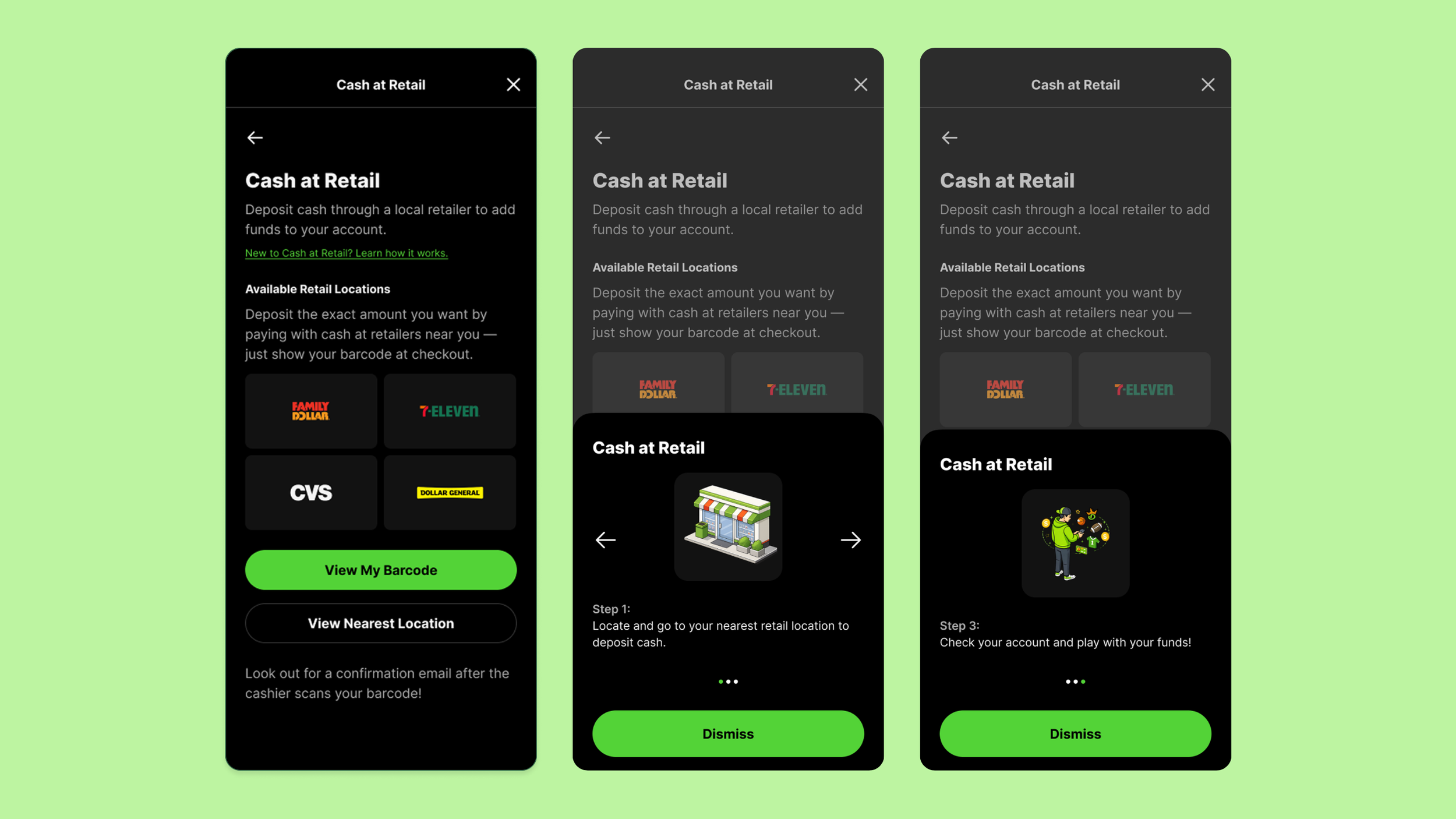
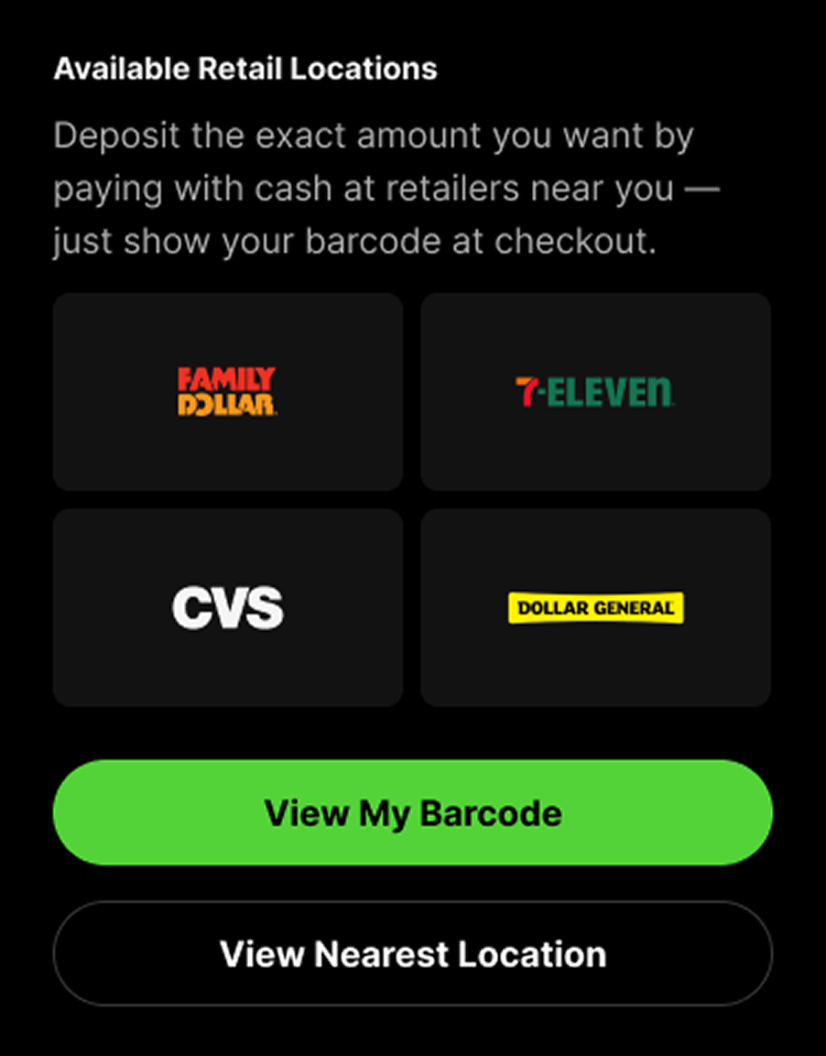
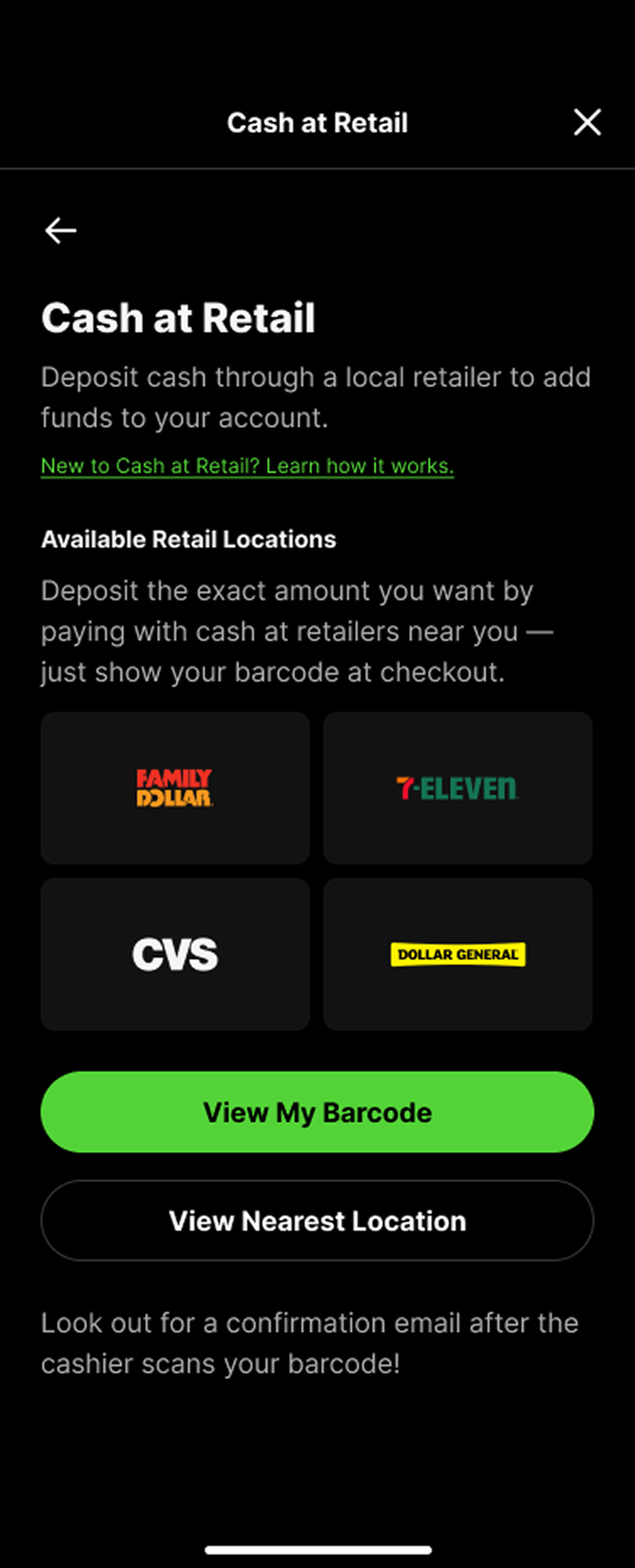
Going into the project, my first instinct was to let the interface do as much of the explaining as possible. We knew people weren't going to read a wall of instructions, so I leaned on recognizable retailer brands like CVS and Family Dollar to communicate where users could deposit their cash.
I hoped that when users landed on the page, they'd immediately connect the dots: recognize a nearby retailer, tap View My Barcode, and understand they were taking the first step toward an in-store cash deposit.
What We Learned
Once we put the experience in front of users, it became clear we'd only solved part of the problem.
The retailer-first approach worked well for users who were already familiar with Cash at Retail. They found the page easy to scan, understood where they could deposit, and knew what to do next.
But testing also showed that first time users were still moving through the flow with a bit of uncertainty. They generally understood what they needed to do, but the journey wasn't as immediately clear or confidence inspiring as I'd hoped.
That feedback helped shape the next iteration of the experience.
What We Changed
Based on what we learned, I focused on making the process easier to understand for someone using Cash at Retail for the first time.
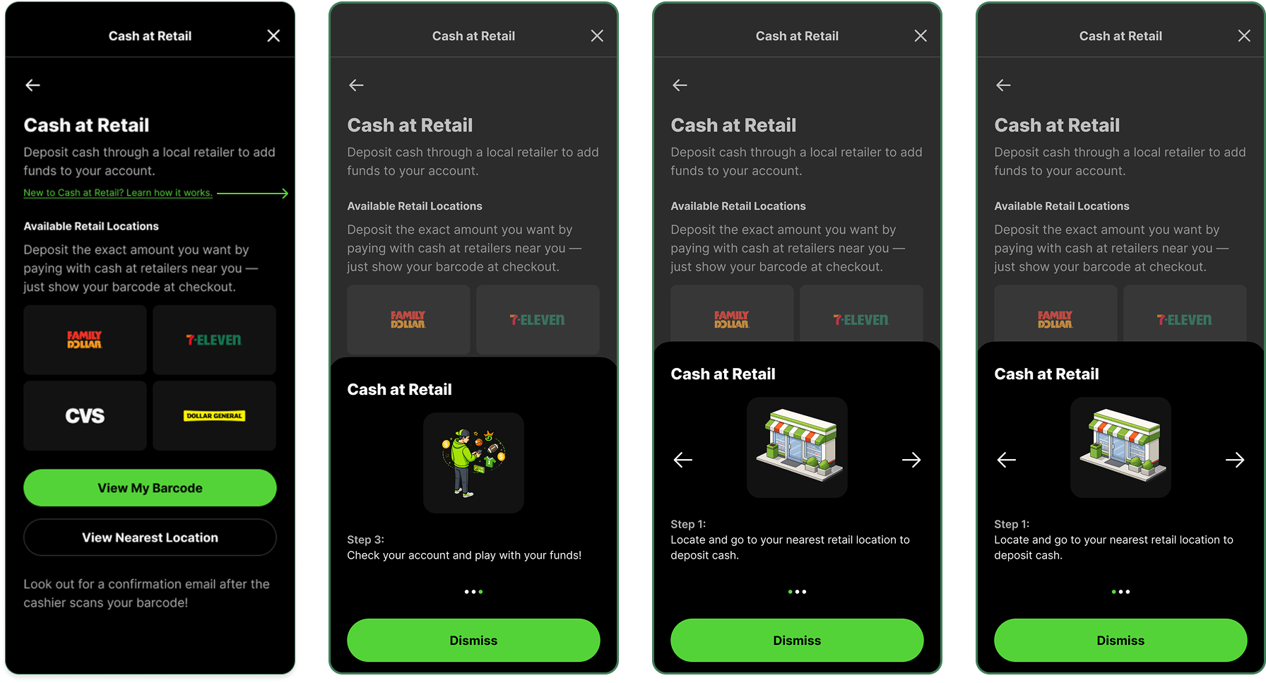
Rather than relying on additional instructional copy, we introduced a simple three-step onboarding that explained how to generate a barcode, visit a participating retailer, and complete the deposit in store.
We paired each step with simple illustrations so users could quickly understand what to expect without reading through long paragraphs of text.
We also continued to make View My Barcode the primary call to action, reinforcing the next step in the process so users always knew what to do next.
After
Before
After We Launched
After launch, we saw that users had a much clearer understanding of how the Cash at Retail process worked.
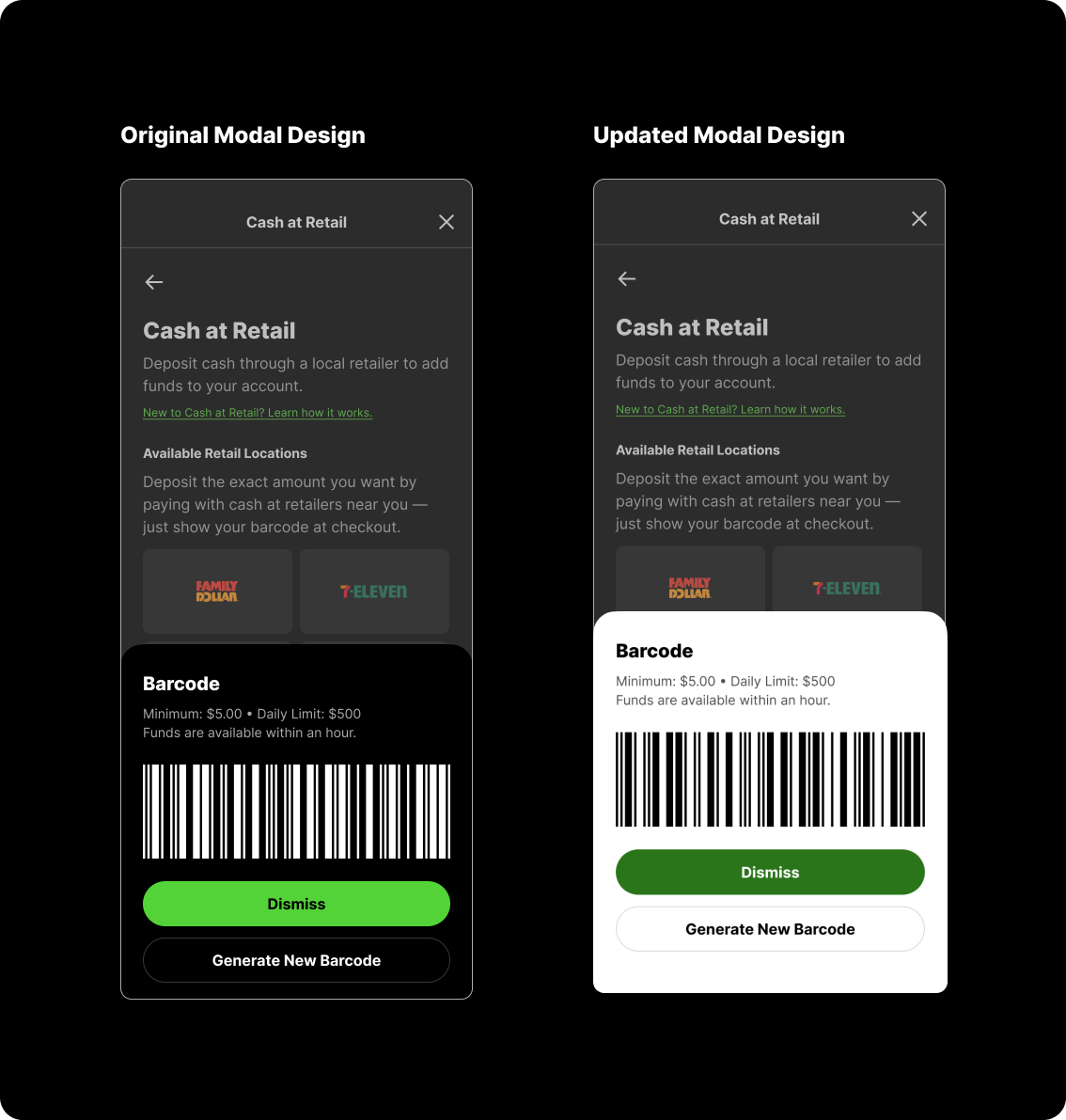
One issue did surface though. While the experience itself was easy to understand, the barcode wasn't scanning reliably in some retail environments. We had originally designed it as a white barcode on a dark background to match the rest of the product, but some retail scanners struggled to read it.
We quickly updated the design to use a traditional black barcode on a white background, which significantly improved scan reliability.
It was a simple change, but a good reminder that designing for experiences that extend into the real world sometimes means prioritizing function over visual consistency.
Outcome & Reflection
The redesign made Cash at Retail easier to understand from start to finish while creating a more reliable in-store experience.
It resulted in:
A clearer first-time experience for users completing a Cash at Retail deposit.
Successful migration of Cash at Retail to DraftKings' native payments platform.
Improved in store reliability through a post launch barcode iteration.
One of my biggest takeaways from this project was realizing that the user experience didn't end when someone left the app.
Designing Cash at Retail reminded me that some of the most important moments happen outside the interface. Whether a user is driving to a retailer, pulling up a barcode at the register, or handing cash to a cashier, those interactions are all part of the product experience. It reinforced that good product design isn't just about the screens we create—it's about thinking through the entire journey and making sure every step feels intuitive.