

The Project
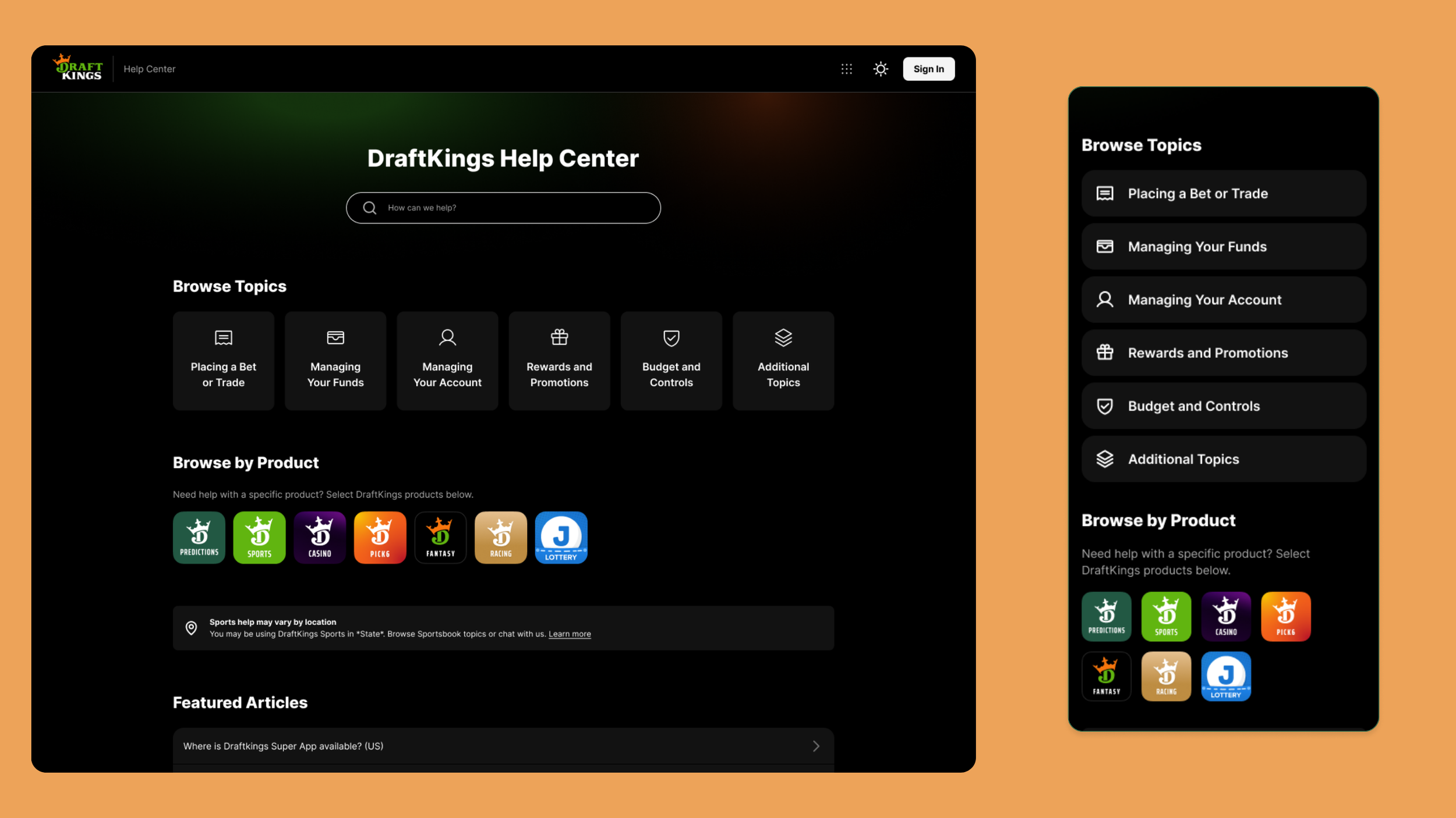
The DraftKings Help Center helps users quickly find answers to common questions without needing to contact support.
As part of the launch of the DraftKings Super App, I led the end-to-end redesign of the Help Center. The existing experience was organized around DraftKings products, but as the platform expanded, we needed a structure that better reflected how users actually looked for help.
The challenge was balancing a more browse-friendly experience while still making product-specific support easy to find.
Where we Started
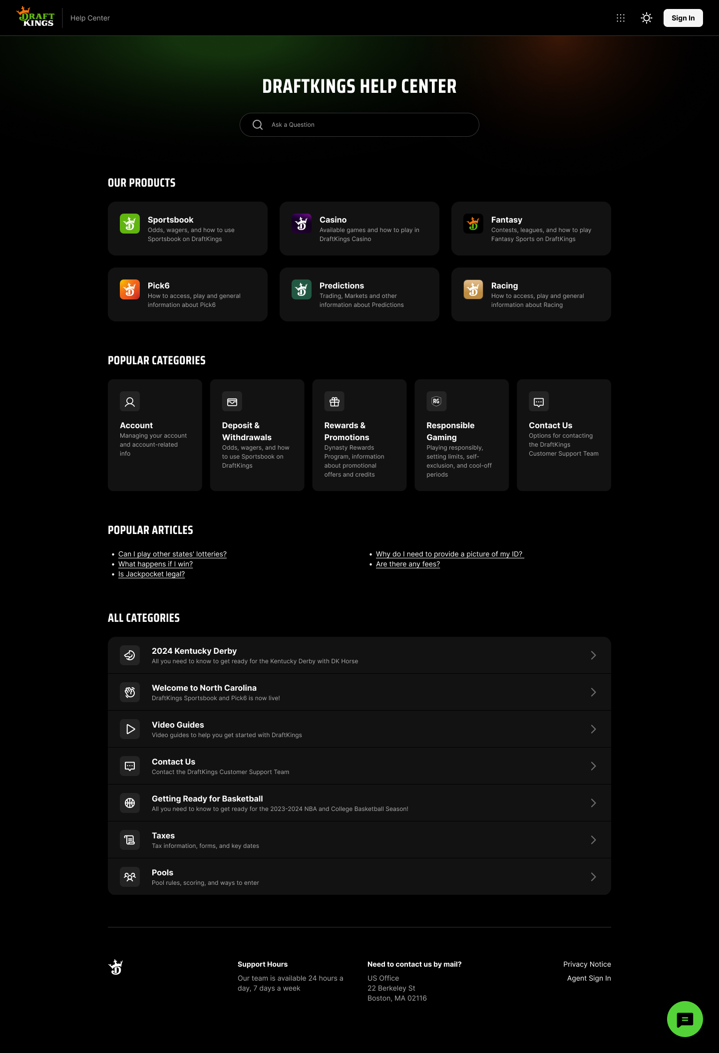
The existing Help Center already had a strong search experience and featured articles, but the homepage still led with product-specific categories. With the introduction of the Super App, I saw an opportunity to shift that focus toward the questions and tasks users actually came to the Help Center to solve.
After reviewing other multi-product platforms, I noticed a common pattern: support experiences were organized around what users were trying to accomplish rather than the products themselves. My hypothesis was that by prioritizing common topics, search, and popular questions, we could help users find answers faster while still keeping product-specific support easy to access.
Before

What we Learned
The competitive analysis reinforced that users don't think about support the same way products are organized internally.
While organizing the Help Center by product made sense historically, it became clear that many users were simply trying to solve a problem. They weren't thinking, "I need help with Sportsbook." They were thinking, "Whats the difference between placing a bet and a trade?" or "How do I verify my account?"
That insight helped shape the direction of the redesign. We shifted toward a topic-first experience while still keeping product-specific navigation available for users who preferred to browse that way.
What we Changed
Based on what I learned, I focused on making it easier for users to find help in a way that felt most natural to them.
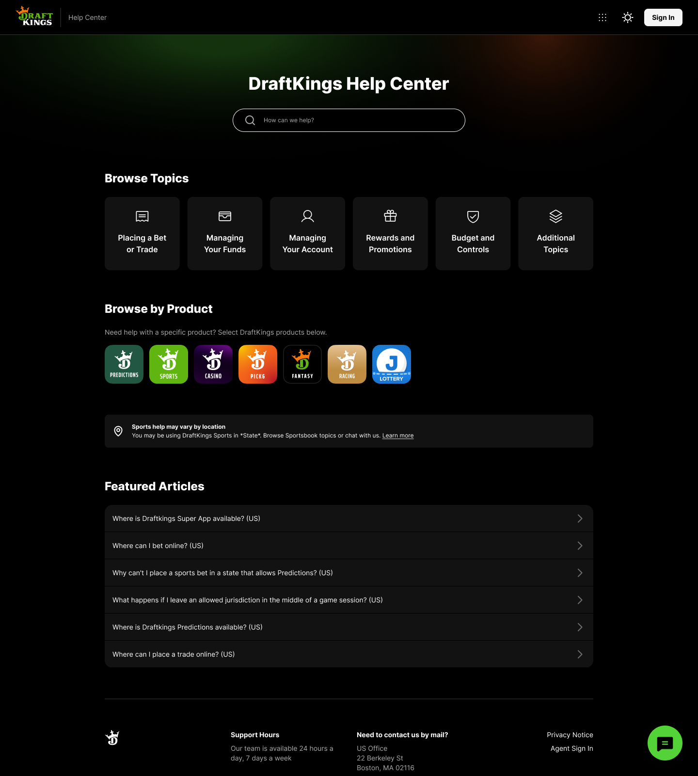
I made search a more prominent entry point by increasing its visual emphasis, adding more conversational copy like "Ask a question," and creating more breathing room around the search bar. Because the Help Center's AI-powered search could quickly surface relevant articles, I wanted users to feel confident starting there rather than browsing through multiple categories.
I also shifted the homepage to a Browse by Topic approach, replacing product-first navigation with scannable topics like Placing a Bet or Trade and Managing your Funds. Pairing each topic with iconography made the page easier to scan while helping users quickly identify the type of support they needed.
In our initial exploration, we removed product navigation entirely. As we worked with the Shared Services team, however, we learned the Help Center's content was still organized by product behind the scenes. Rather than leading with products, I reintroduced Browse by Product as a secondary section beneath the topic-first navigation. This kept the homepage focused on user intent while still making product-specific support easy to access.
After

Future Opportunities!
Even after launch, I continued exploring ways to make finding help feel faster and more conversational.
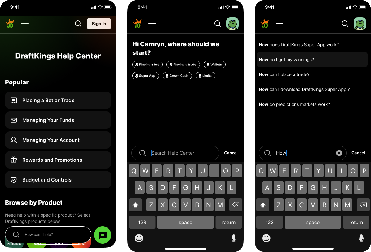
One concept I explored was making search the center of the experience. Instead of asking users to scroll back to the top whenever they wanted to search, I designed a floating search bar that stayed accessible as they browsed the Help Center. Selecting it opened a dedicated search experience with a personalized greeting like "Hi Camryn, where should we start?" along with suggested topics to help users get started quickly.
The goal was to make the Help Center feel a little more welcoming while giving users multiple ways to find the information they needed, whether they wanted to search naturally or start with a recommended topic.
Outcome & Reflection
The redesigned Help Center successfully launched alongside the DraftKings Super App, creating an experience that better reflected how users looked for support across a growing ecosystem of products.
It also:
Shifted the homepage from a product-first to a topic-first experience.
Made AI-powered search a more prominent path to finding answers.
Balanced intuitive navigation with the Help Center's existing content structure.
Created a more scannable homepage through clear information hierarchy and iconography.
This project was especially meaningful because it was one of the first end-to-end product experiences I led. It gave me the opportunity to drive design decisions, collaborate closely with Product and Engineering, and see a feature through from early exploration to launch.
It also reinforced something I still think about today: good information architecture starts with understanding how users think, not how products are organized internally. That mindset continues to shape how I approach complex product problems.
To view live designs click here!