

Flower Bar is a full-service florist and garden center based in Atlanta, Georgia. They specialize in flower delivery, gardening supplies, special events and DIY workshops. They employ local staff and although customers are varied – they all have an interest to shop local.
Since COVID however, the steady flow of foot traffic has come to a halt, and Flower Bar needed help redesigning their website to grow their online customer base. I redesigned the Flower Bar website, both structurally and aesthetically, to help users continue to shop local, stay safe and stop and smell the roses along the way.
Role: This was an individual project where I was responsible for all aspects of the design. I conducted all research, ideated concepts, designed & prototyped, and continuously iterated based on user feedback.
Methods Used: Competitive Research, User Interviews, Affinity Map, Card Sorting, User Persona, User Flow, Problem Statement, Sketching, Usability Testing
Tools: Figma, Google Surveys, Optimal Workshop, Zoom
Timeline: 2-Week Sprint (October 2021)
Challenge
Flower Bar needed help making their online shopping experience just as lovely as the in-person one. Their current website was difficult to navigate and outdated. I was tasked with re-designing the Flower Bar website to create an online experience that was just as lovely as the flowers they sell.
These are concept designs for our student project during a User Experience Design Fully Immersive program at General Assembly.
Outcome
To grow Flower Bar’s online business, I redesigned a website that now reflects the core interests, goals, and needs of the user while also keeping business needs at the forefront of my mind. I worked diligently to give users an online experience just as delightful as the in-person one, making it easy for users to explore different flowers, plants and new products.
The Solution
A design fresh as roses
I was tasked with providing a solution that allows users to explore flowers, plants and gardening products so that they can purchase flowers for loved ones, plants to decorate their homes and gardening supplies to create a garden of their own. So, I designed a fresh new website that lets the user easily navigate between the range of products available, view recommended and popular products and checkout with ease - all while support a local business.
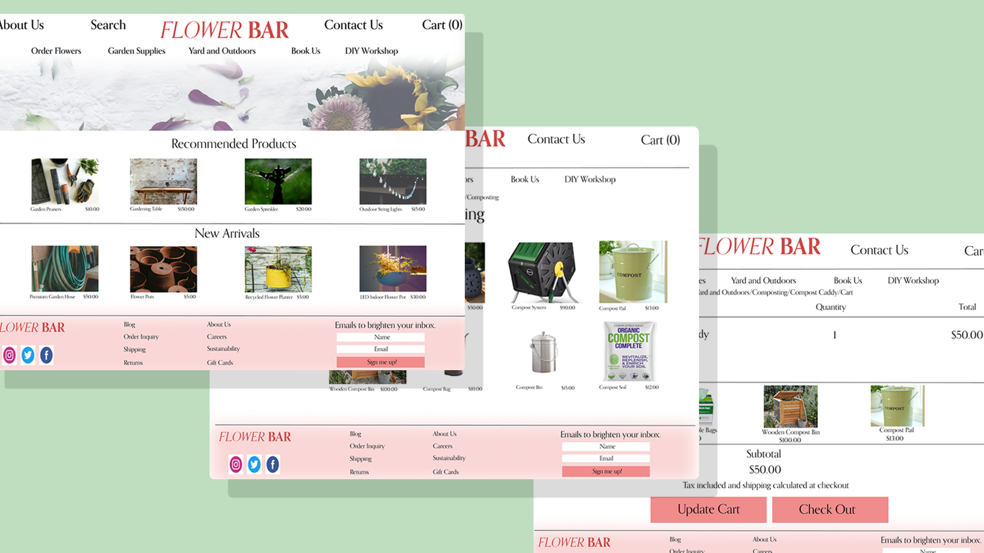
Here’s what the website redesign included:
I was able to redesign Flower Bar’s website to help users support a local business, gift flowers, decorate their homes and more - but how exactly did I get there?
Read more about my research process below!
User Persona
Empathizing
To begin, I visited Flower Bars current website in order to get an understanding of how the company is presenting its brand and business. Once I gained enough insight, I was able to dive into understanding our target user.

This persona helped guide my design decisions moving forwards and made sure that my design was centered on who our user Lisa is.
Understanding our User
-
51 years old
Lives in Atlanta, Georgia
Works in sales and marketing
Lives with her husband and two dogs
Behaviors
Lisa is a gift giver. She loves to shop locally. She makes decisions quickly and last minute. She purchases items based off of recommendations and wants to give gifts that are meaningful based off of the giftee's age and interests.
Likes to shop for gifts within a particular price range.
Does not read reviews on products.
What Problems Are We Solving?
User: Lisa needs a quick way of purchasing locally sourced gifts online so that she can give convenient yet meaningful gifts.
Business: Flower Bar needs an improved website so that they can showcase their products and provide great customer service while continuing to support their local community.
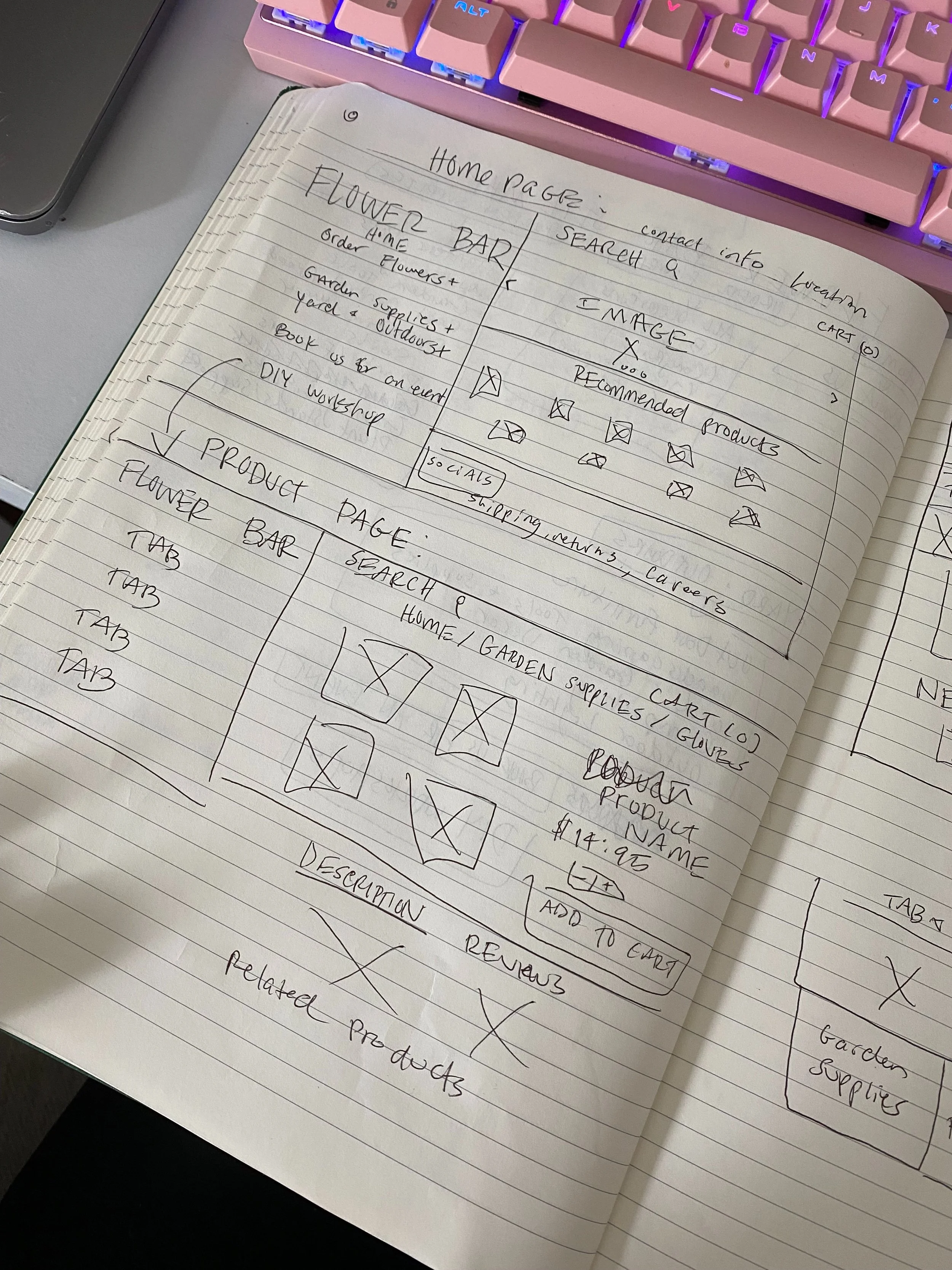
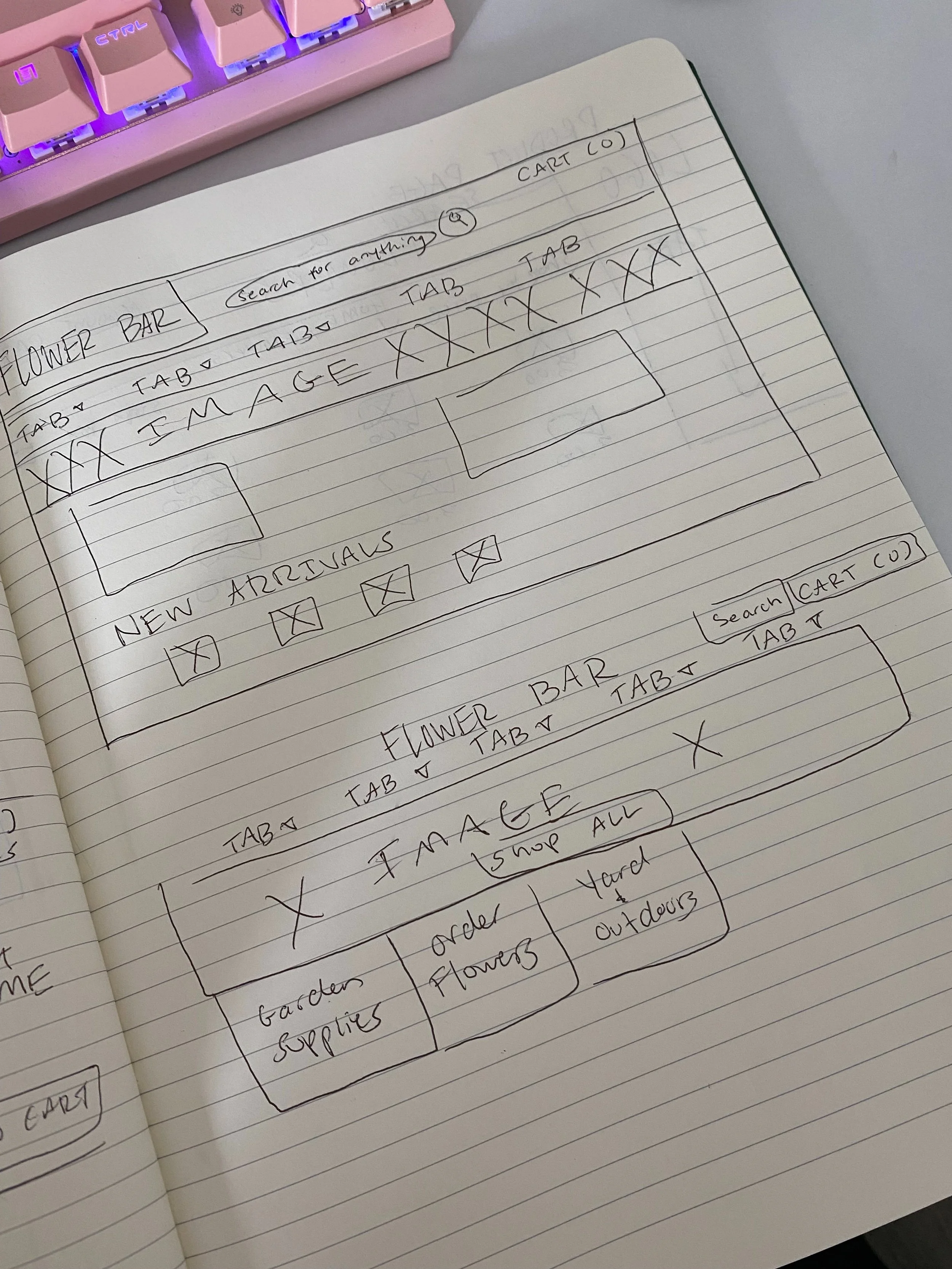
Sketching
At this point, I began sketching different ideas for the layout of Flower Bar’s website. These sketches reflect Lisa’s needs and some common design patterns that I saw when evaluating other e-commerce websites.
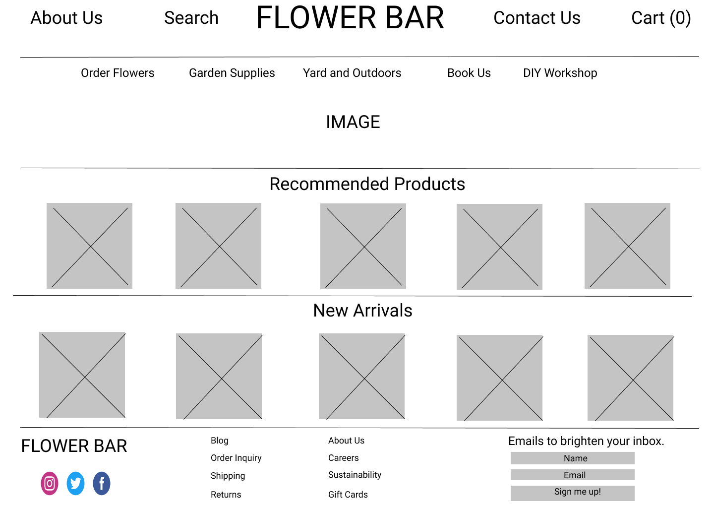
Mid Fidelity Wireframes
After choosing the sketch that best fit Lisa’s needs, I digitized the design in Figma and added just enough information for users to navigate through the pages and complete tasks I would present to them during usability testing. While I would only be testing the desktop designs, I also created mobile versions to ensure that is responsive across different device screens.

Building a Prototype to Test
Using Figma, I created a limited functionality prototype for usability testing to see how users interact with the site and where I could make improvements!
Usability Testing
-
Test Tasks
* Purchase a composting caddy
* Read the reviews on the composting caddy
* Read the about us page
-
Summary
* Method: Via Zoom, moderated usability test
* Participants: 5
* Age: 25-50 years
* Task Completion Rate: 100%
-
Insights
4 out 5 users were confused by the "Update Cart" button on the checkout page. Users were not user of whether to click “Update Cart” or “Check Out” to continue
-
Recommendations
* Users prefer to see reviews on the same page as the product, not a separate page
* Users like to see icons for things like “cart”
* Rather than 4 smaller images on a product page, users want to see one larger photo with a scrolling option
Priority Revisions
Using what I learned from the usability testing, I started to make revisions to my designs and created a final mockup!
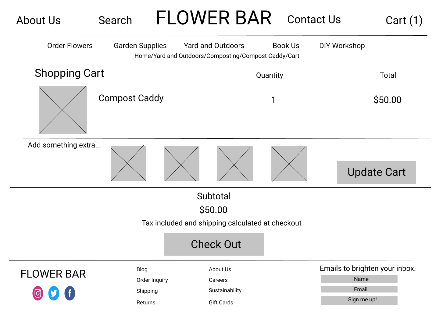
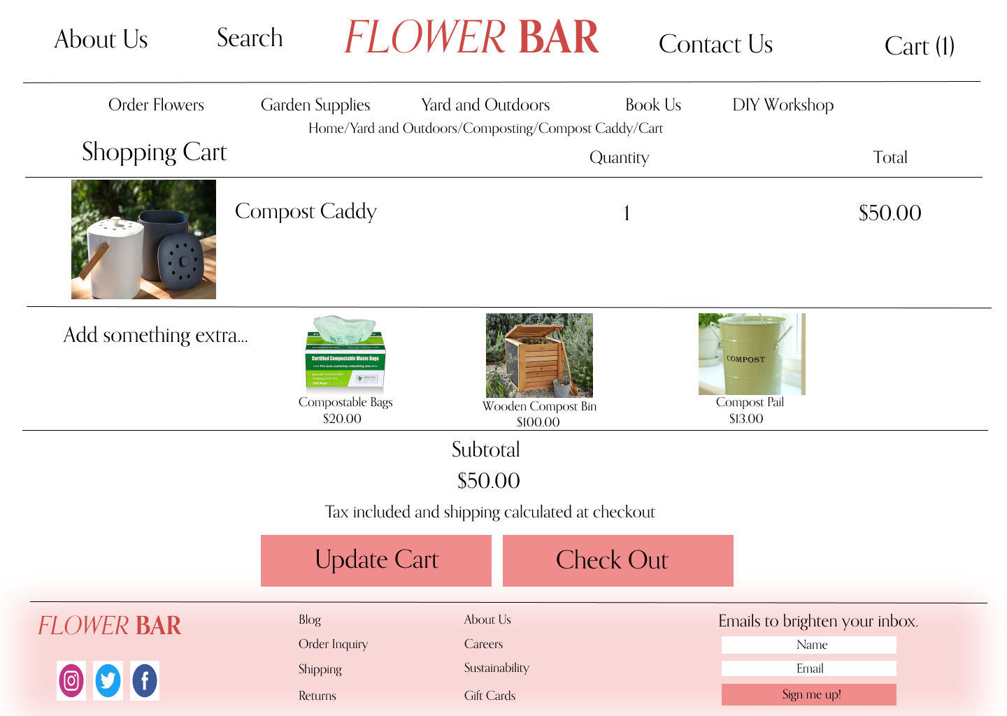
Move the “Update Cart” button next to “Check Out” button
Before
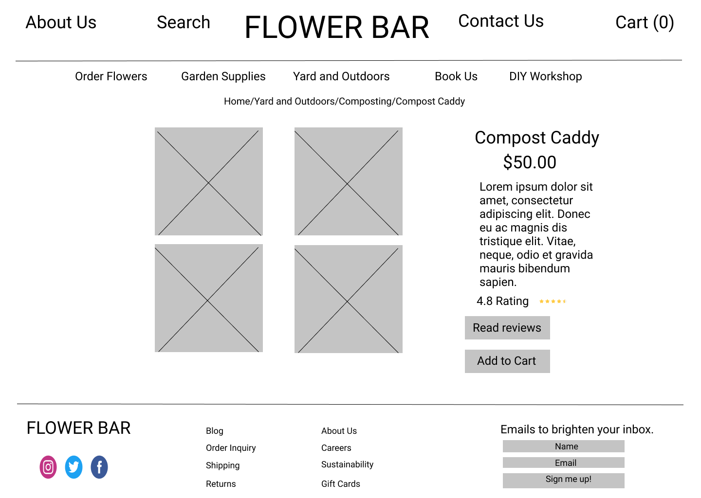
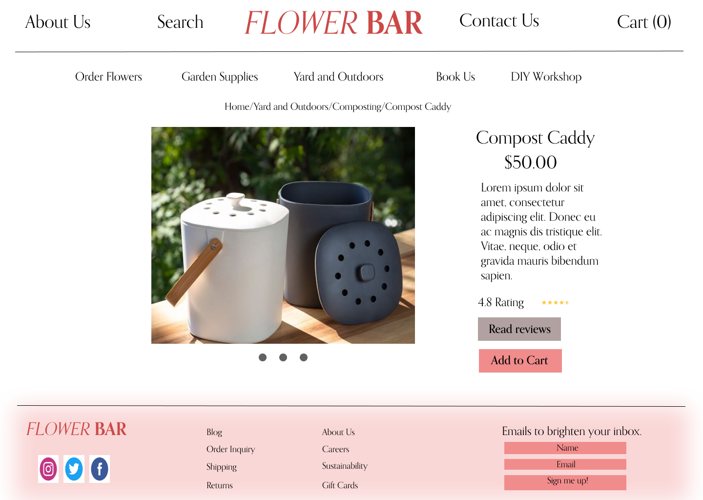
2. On product pages, have one larger image with a scrolling option, rather than multiple smaller images
After
Reflection and Next Steps
Everything is coming up roses!
If I had more time to work on designs, I would:
Design flows for additional products
Source a larger variety of product images
Create a logo
Replace filler text with real descriptions, reviews, etc.
Reflection
This project was one of great importance and meaning for me. It was the first project that I was solely responsible for the success or failure of. This project challenged me in ways that strengthened my research skills, grew my empathy, and refined my design skills. Here are the hard lessons I learned that I’m grateful for:
Don’t be so hard on yourself
This project was one that created quite a bit of stress for me. I often found myself glued to my computer till 1 am when I had to be awake for class at 5 am. Because of this, I learned how important it is to be more intentional with the time I was working, narrow down scope, and when its time to take a step away from the computer and sleep on it.
Always growing
Looking back on my designs for this case study, there are over a million things that I would change. I learned that instead of obsessing over these details and feeling ashamed for not incorporating these changes sooner, I can feel a sense of pride in knowing that I am evolving as a designer.