

The Project
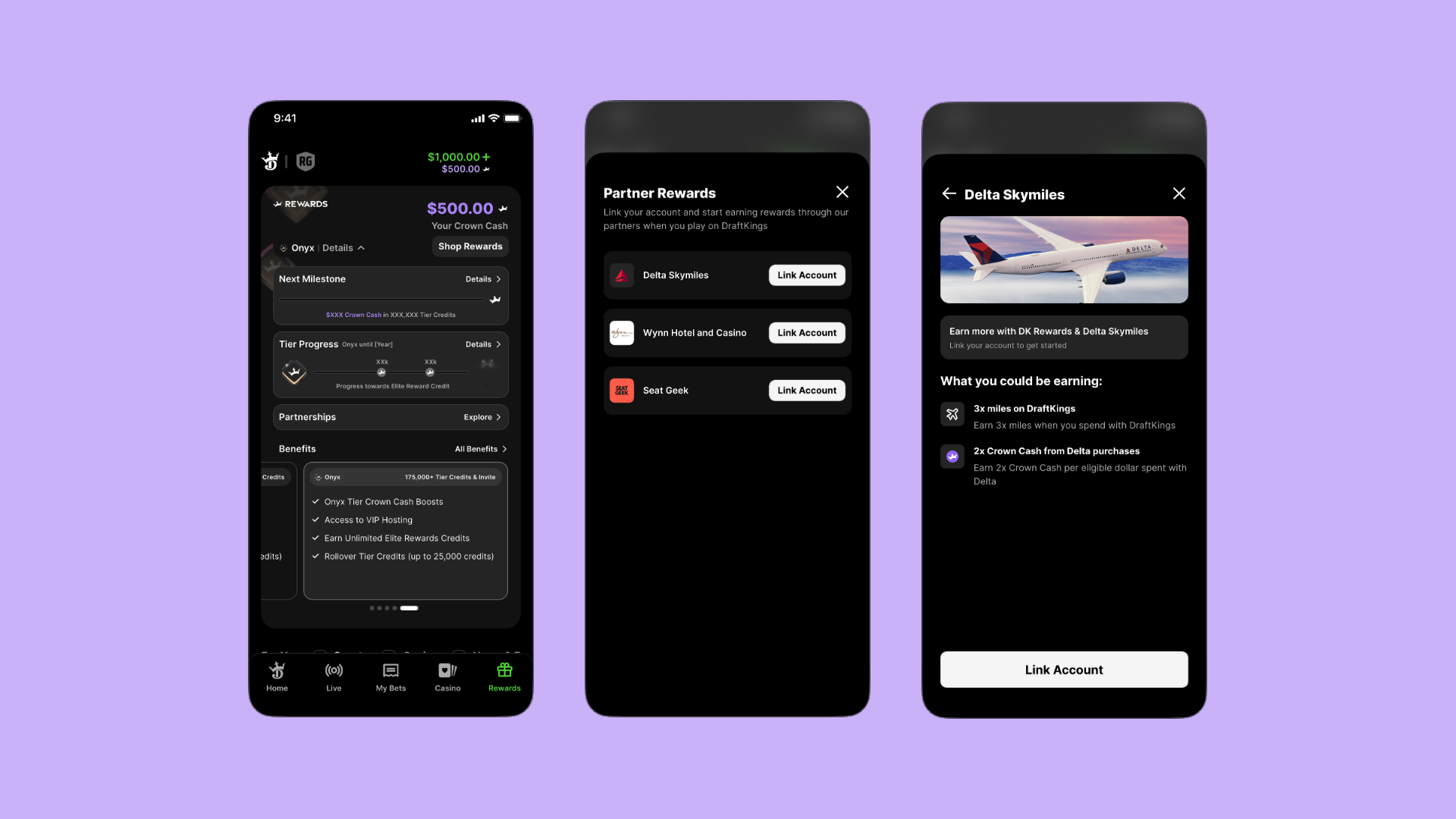
Partnerships was a new feature introduced to the DraftKings Rewards Center that allowed users to link eligible loyalty accounts and earn additional rewards through their play on DraftKings.
Working alongside a senior designer, I led product strategy and end-to-end design exploration to create an experience that clearly communicated the value of each partnership while making account linking feel simple and trustworthy.
Where I Started
Since Partnerships was a brand new feature, we weren't just redesigning an existing experience like we had in previous projects. We were starting from scratch!
One of the first things I did was look at how other companies approached partnerships. After reviewing experiences from companies like Uber, Starbucks, DoorDash, and Delta, I noticed a common pattern: recognizable brand imagery played a major role in helping users quickly understand the partnership.
That shaped my initial hypothesis. I believed familiar partner logos paired with clear value propositions would help users immediately recognize brands they already trusted and understand exactly what they would gain by linking their account. Rather than relying on lengthy explanations, I wanted the experience to feel visual, easy to scan, and straightforward to navigate.
What Changed My Thinking
As we continued exploring the feature, I realized there wasn't just one right way to introduce partnerships.
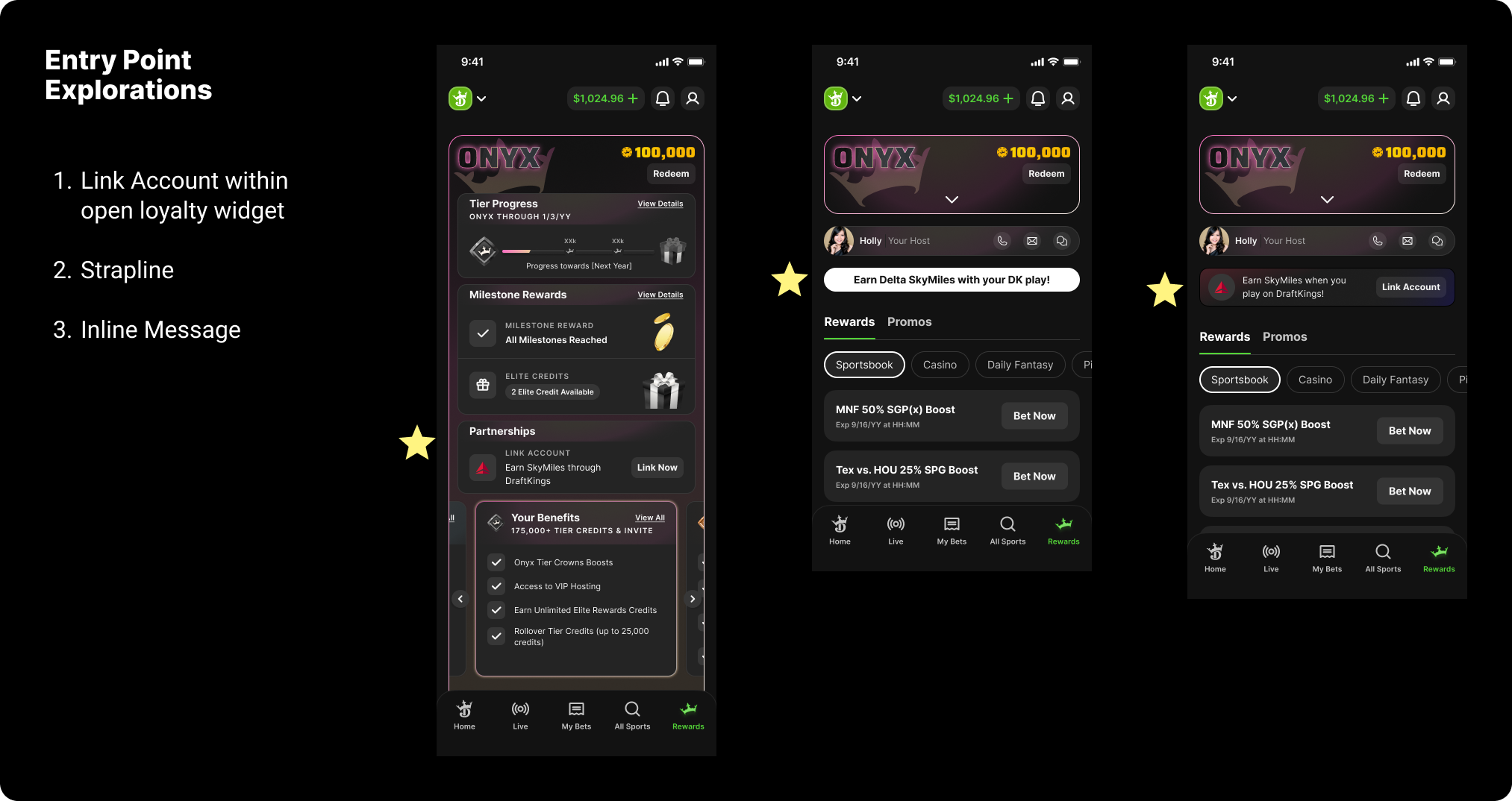
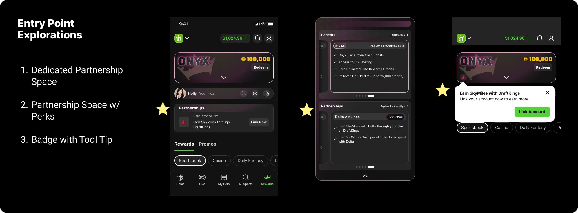
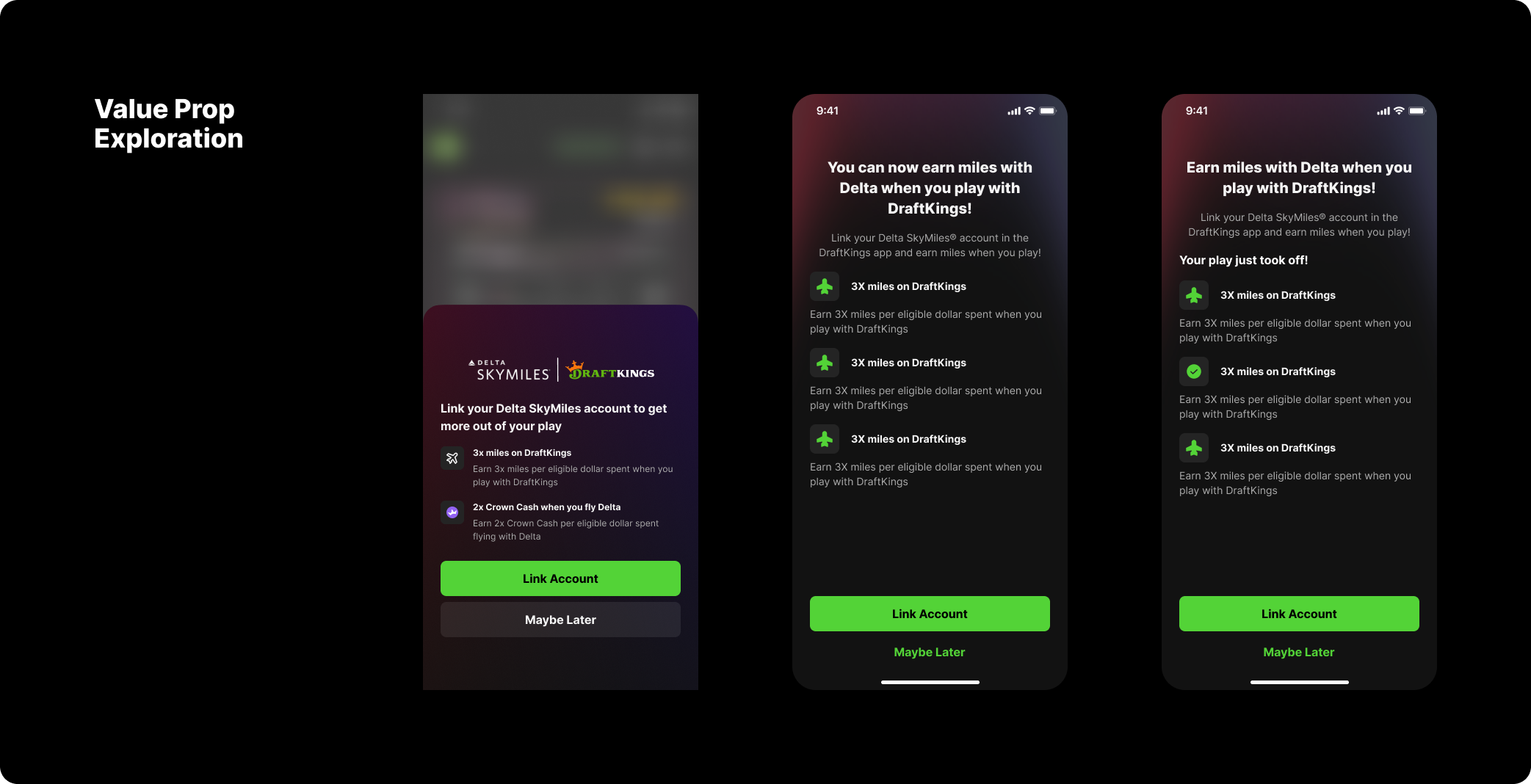
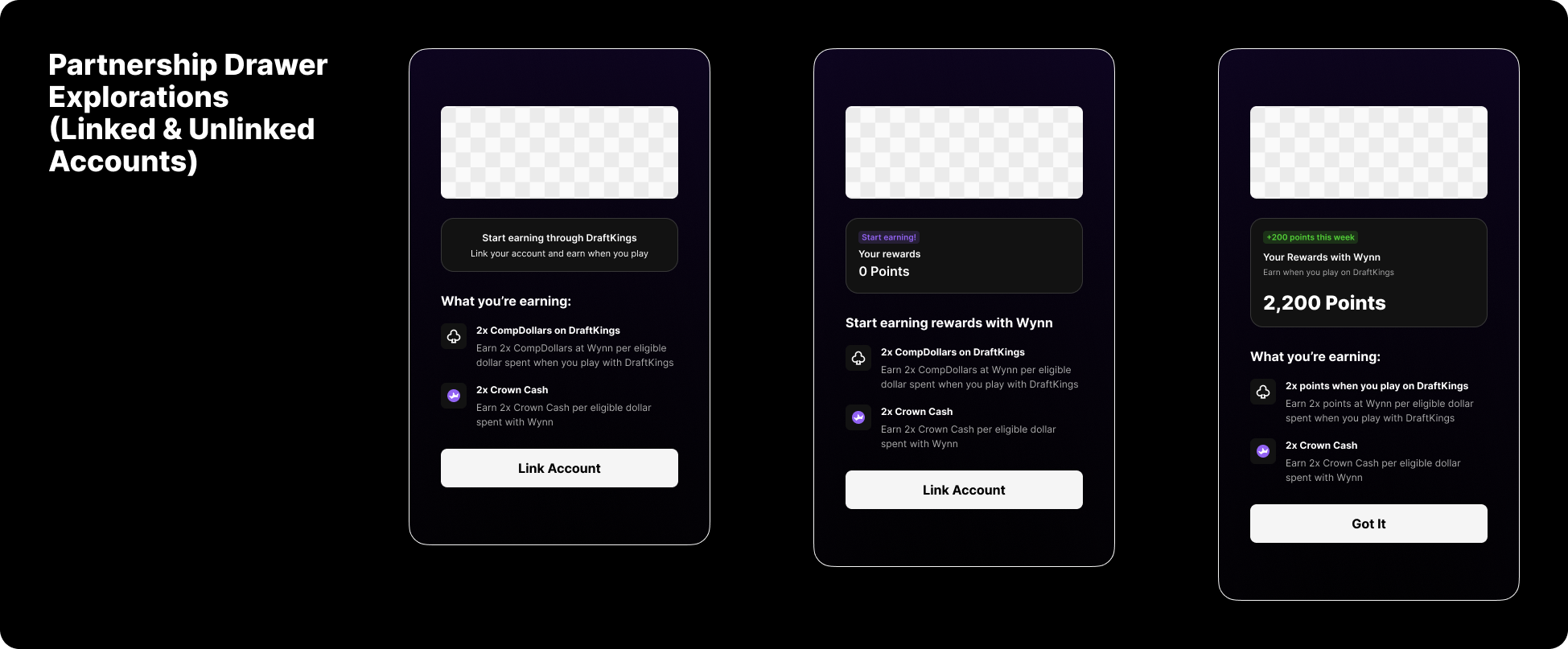
I explored a wide range of concepts—from different Rewards Center entry points and partnership cards to various drawer layouts, linked and unlinked account states, reward summaries, and ways of communicating each partnership's value.
One piece of feedback from my team stuck with me throughout the project: explore more. Instead of settling on my first solution, I challenged myself to generate significantly more concepts before narrowing in on a direction. That shift not only strengthened this project, but changed how I approach design today!
What We Changed
Based on those explorations, I focused on making partnerships feel both familiar and valuable from the very first interaction.
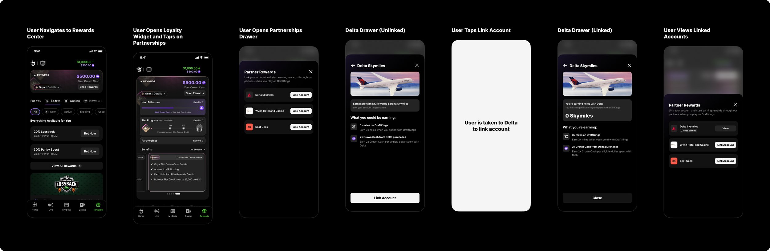
I made recognizable partner logos the focal point of the experience so users could quickly identify brands they already knew and trusted. Every partnership was paired with a clear value proposition that explained exactly what users would earn by linking their account, helping answer the question, "What's in it for me?" before they ever tapped Link Account.
From there, I simplified the linking experience by creating clear account states that guided users whether they were connecting an account for the first time, had already linked an account, or were waiting to earn their first rewards. Together, these decisions created an experience that felt easy to understand while remaining flexible enough to support future partnerships.
Outcome & Reflection
The project resulted in production ready designs that aligned Product and Marketing Platform around a shared vision for introducing partnerships into the DraftKings Rewards Center. The experience was successfully handed off for development and planned for a future product release.
It also:
Introduced a scalable framework for future partner integrations.
Clearly communicated the value of linking loyalty accounts.
Simplified the account linking experience through clear states and hierarchy.
Established a flexible design foundation that could support additional partnerships over time.
One of my biggest takeaways from this project wasn't just about partnerships. It was about exploration. Early on, I received feedback that I wasn't pushing my concepts far enough. From that point on, I challenged myself to explore significantly more ideas before committing to a direction. It's a lesson that has stayed with me, and one that continues to shape how I approach every design problem today. I rarely stop at my first solution, and I've learned that even the ideas that don't ship often influence the strongest ones that do.
My team and I would also say: “never delete anything!” Even if a design doesn't make it into the final product, it might inspire a better solution later or help explain why another direction is stronger. It's advice that's stuck with me ever since, and it's completely changed how I approach design exploration.